Writing
- 2026
-
26 APR
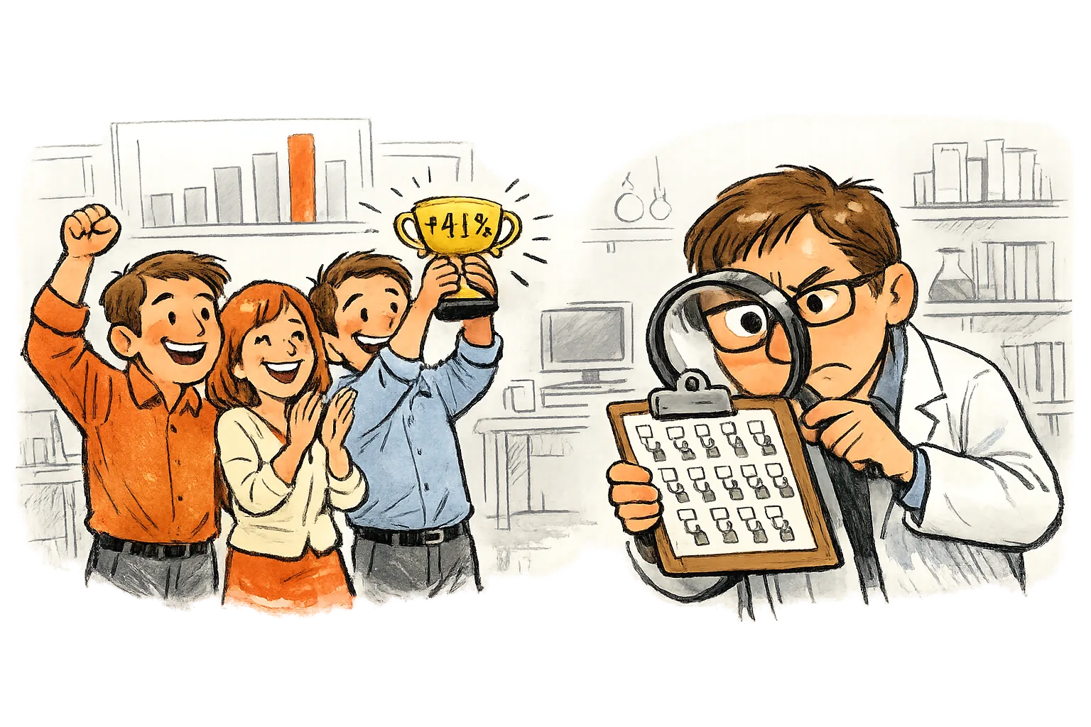
Why You Can't Trust 'We Tried It'
Comparing a new approach to the old version doesn't tell you what you think it does. Randomized controlled trials are the only way to be sure the change is what caused the difference.
6 min read -
24 MAR

Is the Pattern Real?
Your cross-tabulation shows different results across groups. The chi-squared test tells you whether those differences reflect a real pattern or just random noise in who ended up where.
5 min read -
23 MAR
The More You Look, the More You'll Find
Run enough tests on the same data and something will look significant by pure chance. Multiple comparison corrections keep you from fooling yourself when you test many things at once.
5 min read -
22 MAR

Big Enough to Matter
A result can be statistically significant and still too small to care about. Effect size measures how big the difference actually is, separating what's real from what's worth acting on.
5 min read -
21 MAR
How Many People Do You Actually Need?
Before you launch a survey or A/B test, you need to know how many people it takes to get a useful answer. Too few and you're wasting everyone's time. Too many and you're wasting resources.
5 min read -
20 MAR
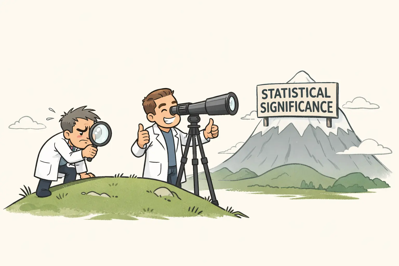
Are You Looking Hard Enough?
Your A/B test came back 'not significant.' But was the test actually capable of finding a real difference? Statistical power tells you whether your test had a fighting chance.
5 min read -
19 MAR
The Two Ways to Be Wrong
Every data-driven decision risks two kinds of mistakes. Type I errors mean acting on noise, and Type II errors mean missing something real.
4 min read -
18 MAR
The Range Where the Truth Lives
A single number from a sample is never exactly right. A confidence interval tells you the range of plausible values for the truth, and how much uncertainty you're carrying.
5 min read -
17 MAR
When the Full List Wasn't Enough
Your team needs 1,000 donations before a vote. Historical data says 1.5% of emails convert. You plan for 67,000 sends. The negative binomial distribution reveals why that plan has a coin-flip chance of failing.
4 min read -
17 MAR
What If Nothing Changed?
Your new action alert template got more clicks. But did it actually work, or did you just get lucky? The null and alternative hypotheses give you a framework for finding out.
4 min read -
17 MAR
How Surprised Should You Be?
Your campaign got more clicks than usual. Was it real or random? The p-value puts a number on that question, measuring how surprising your result would be if nothing actually changed.
4 min read -
13 MAR
Which Campaign Actually Won?
A 30% open rate from 50 emails and a 24% open rate from 2,000. Your campaigner calls it obvious. The beta distribution says not so fast.
5 min read -
12 MAR
When the Numbers Finally Settle Down
Small samples produce wild, unreliable numbers. The law of large numbers guarantees that your metrics will converge to the truth if you collect enough data.
4 min read -
11 MAR
Why Averages Behave Better Than Individuals
Individual donations are wildly unpredictable. But the average of a random sample? Remarkably stable. The central limit theorem explains why, and it's the reason most of statistics works at all.
4 min read -
10 MAR
The Few Who Carry Everything
20% of your donors probably provide 80% of your revenue. That's a real risk. A power law shapes nearly every nonprofit's funding, and it demands a deliberate strategic response.
5 min read -
9 MAR
How Many Is Too Many?
Your donation page averages 26 gifts per day. Yesterday it got 38. Is that a signal or just the natural lumpiness of random events? The Poisson distribution tells you.
4 min read -
8 MAR
Was That Spike Real?
If 12% of petition signers usually share your email, is 168 shares out of 1,200 asks worth celebrating? The binomial distribution tells you whether a result is a signal or just noise.
4 min read -
7 MAR
When the Bell Curve Actually Fits
The normal distribution is the most famous shape in statistics. It's also the most assumed. Here's what it actually means and when your nonprofit data follows it.
4 min read -
6 MAR
The Hidden Denominator
Your click rate is 3%. Or is it 12%? Both numbers are correct. Conditional probability explains why the answer depends entirely on who you're counting.
4 min read -
6 MAR
The Stupidest Person in the Room
I have two university degrees, I'm finishing a third, and I was in Germany's gifted scholarship program. And yet I regularly sit in meetings understanding the least. That used to embarrass me. Now people tell me it's one of my biggest strengths.
4 min read -
5 MAR
Why Your Prospect List Is Full of False Alarms
Your wealth screening tool says 200 donors are major gift prospects. But most aren't. Bayes' theorem explains why even accurate tools produce misleading results when what you're looking for is rare.
4 min read -
4 MAR
The Gift That Broke the Spreadsheet
One enormous donation just landed in your data. Is it a data entry mistake, a once-in-a-lifetime windfall, or a sign that your metrics have been wrong all along? Outlier detection helps you figure out which.
4 min read -
4 MAR
When Anyone Can Build Anything
AI tools let anyone ship working software in hours. For nonprofits that have always been resource-constrained, the old excuses no longer hold. The question now is who moves first.
5 min read -
3 MAR
What Goes in the Empty Cells?
Your donor database has gaps. You can delete the incomplete rows, fill them with averages, or let the rest of the data guide your guesses. Each choice reshapes what the numbers tell you.
5 min read -
2 MAR
The Donors Who Didn't Answer
You sent a survey to 2,000 donors. Only 800 responded. The average satisfaction score looks great. But whether you can trust it depends entirely on why the other 1,200 stayed silent.
4 min read -
1 MAR
Not All Numbers Are Created Equal
Your spreadsheet says the average program area is 2.4. But program areas are labels, not measurements. Before you compute anything, check what kind of data you're actually working with.
4 min read -
28 FEB
What Your Retention Rate Isn't Telling You
Your overall retention rate is 38%. But when you split donors by channel, three very different stories emerge. Cross-tabulations reveal patterns that single numbers hide.
3 min read -
27 FEB
A Picture Worth a Thousand Averages
Before you compute a single average, look at how your data is distributed. Frequency distributions and histograms reveal what summary statistics compress.
4 min read -
26 FEB
Not Everything Is a Bell Curve
Your data has a shape, and it's probably not the symmetrical bell curve you're picturing. Skewness and kurtosis describe what's really going on.
4 min read -
25 FEB
What Does It Mean to Be in the Top 10%?
Your board wants to know who your 'top donors' are. Percentiles and quartiles give you a precise way to answer.
4 min read -
24 FEB
Two Campaigns, Same Average, Totally Different Stories
Two email campaigns both average a 4% click rate. But one is reliable and the other is chaos. Standard deviation explains why.
4 min read -
23 FEB
Where Did All That Money Go?
Your average donation is €47. But most donors give €15. What's going on? An introduction to mean, median, and mode.
3 min read